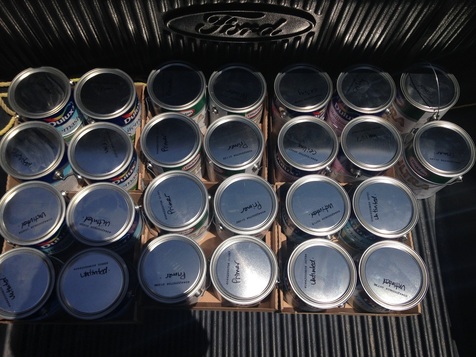
Back in June, Dulux had their annual Buy One, Get One sale on one gallon cans of paint. That included primer, ceiling paint and their super durable LifeMaster paint. I hadn't 100% decided on paint colours at that point and we were still over 2 months away from putting paint on any walls so I opted for taking the paint untinted and plan to bring the cans in as I needed them tinted and shaken. The store is on my way home from work so it doesn't cause any inconvenience.
This is what $1,535 (pre discount) of paint looks like in the bed of an F150:
This is what $1,535 (pre discount) of paint looks like in the bed of an F150:
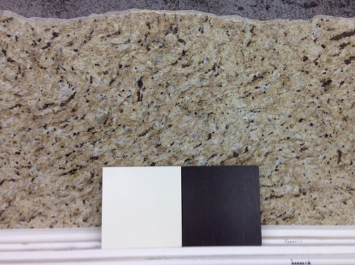
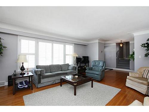
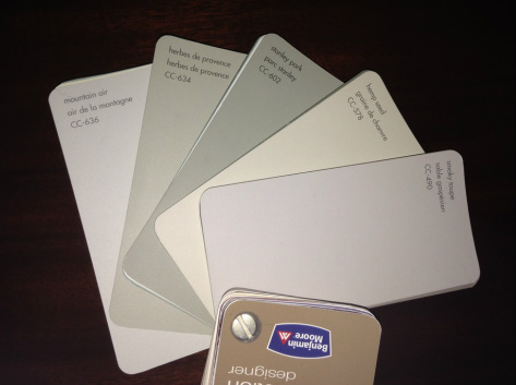
Although it will still be a few weeks before we are ready for colour, I have finalized my paint choices for the main floor and part of the upstairs.
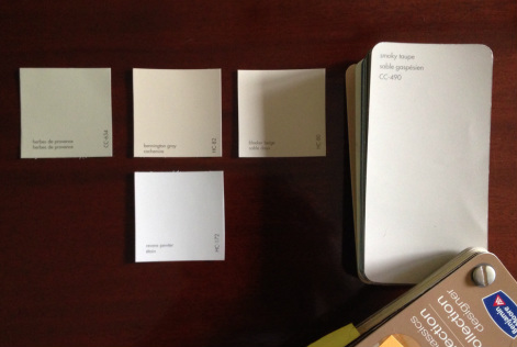
Main Floor- CC-634: Herbes de Provence
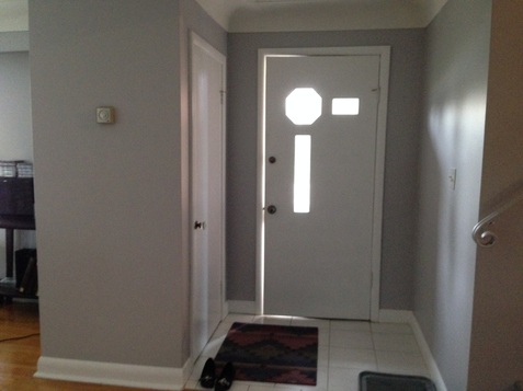
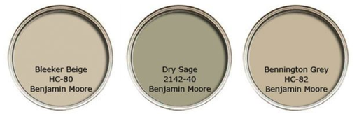
Front Entry and Upstairs Hallway- HC-82: Bennington Gray
Spare Room- HC-80: Bleeker Beige
Master Bedroom- HC-172: Revere Pewter
Gym Level- CC-490: Smoky Taupe
Front Entry and Upstairs Hallway- HC-82: Bennington Gray
Spare Room- HC-80: Bleeker Beige
Master Bedroom- HC-172: Revere Pewter
Gym Level- CC-490: Smoky Taupe


 RSS Feed